Difference between revisions of "DES/Current/Designer/GetStarted"
(Published) |
(Published) |
||
| (11 intermediate revisions by 2 users not shown) | |||
| Line 6: | Line 6: | ||
|Context=Learn how to get started with Designer. | |Context=Learn how to get started with Designer. | ||
|appname=Designer | |appname=Designer | ||
| − | |overviewtext=Designer is a web-based tool for developing self-service (IVR) and assisted service (routing) applications that run on the Genesys | + | |overviewtext=Designer is a web-based tool for developing self-service (IVR) and assisted service (routing) applications that run on the Genesys Multicloud CX platform. It is an omnichannel solution, enabling you to craft applications that handle voice, chat, and email interactions. |
This video shows a quick overview of Designer and demonstrates a few of its latest features: | This video shows a quick overview of Designer and demonstrates a few of its latest features: | ||
| − | {{ | + | {{Video|id=291561112|width=500|Description=Designer overview}} |
Designer provides easy-to-use, highly functional {{Link-SomewhereInThisManual|topic=Blocks|anchor=top|display text=blocks}} that enable common tasks in a simple and straightforward manner. For example, there are blocks for {{Link-SomewhereInThisManual|topic=Menu|anchor=top|display text=building menus}}, {{Link-SomewhereInThisManual|topic=PlayMessage|anchor=top|display text=playing messages}}, {{Link-SomewhereInThisManual|topic=Segmentation|anchor=top|display text=setting up decision points}}, {{Link-SomewhereInThisManual|topic=RouteAgent|anchor=top|display text=routing interactions to agents}}, and {{Link-SomewhereInThisManual|topic=Survey|anchor=top|display text=offering surveys}}. | Designer provides easy-to-use, highly functional {{Link-SomewhereInThisManual|topic=Blocks|anchor=top|display text=blocks}} that enable common tasks in a simple and straightforward manner. For example, there are blocks for {{Link-SomewhereInThisManual|topic=Menu|anchor=top|display text=building menus}}, {{Link-SomewhereInThisManual|topic=PlayMessage|anchor=top|display text=playing messages}}, {{Link-SomewhereInThisManual|topic=Segmentation|anchor=top|display text=setting up decision points}}, {{Link-SomewhereInThisManual|topic=RouteAgent|anchor=top|display text=routing interactions to agents}}, and {{Link-SomewhereInThisManual|topic=Survey|anchor=top|display text=offering surveys}}. | ||
| − | To build an application, you simply drag blocks from the '''Palette''' and drop them into the '''Application Flow''', which is divided into {{Link- | + | To build an application, you simply drag blocks from the '''Palette''' and drop them into the '''Application Flow''', which is divided into {{Link-SomewhereInThisVersion|manual=Designer|topic=ApplicationPhases|display text=phases}} and represents the application structure. |
For example, you might use the following blocks in the '''Assisted Service''' phase, in which an agent helps a customer. The first block controls the announcement to the caller that they are being transferred, and the second block controls the routing function to an agent: | For example, you might use the following blocks in the '''Assisted Service''' phase, in which an agent helps a customer. The first block controls the announcement to the caller that they are being transferred, and the second block controls the routing function to an agent: | ||
[[File:des_blocks.png]] | [[File:des_blocks.png]] | ||
| − | |requirements=Designer supports the latest versions of the following | + | |requirements====Important!=== |
| + | Some of the features and functionality described in these topics might not be applicable to all deployments. Contact your Genesys representative if you have any questions about what is available in your version of Designer. | ||
| + | |||
| + | ===Supported browsers=== | ||
| + | Unless otherwise noted, Designer supports the latest versions of the following browsers: | ||
*Mozilla Firefox | *Mozilla Firefox | ||
| − | *Google Chrome | + | *Google Chrome (see {{Link-SomewhereInThisVersion|manual=Designer|topic=GetStarted|anchor=note|display text=Important}}, below) |
*Microsoft Edge | *Microsoft Edge | ||
*Apple Safari | *Apple Safari | ||
| + | '''Not supported:''' Internet Explorer (all versions) | ||
| + | {{AnchorDiv|note}} | ||
| + | {{NoteFormat|For Google Chrome, Designer supports the ''n''-1 version of the browser, i.e. the version prior to the latest release.|}} | ||
| + | |||
| + | ===Minimum display resolution=== | ||
The '''minimum''' display resolution supported by Designer is '''1920 x 1080'''. | The '''minimum''' display resolution supported by Designer is '''1920 x 1080'''. | ||
| + | |||
| + | ===Third-party cookies=== | ||
| + | Certain features in Designer require the use of third-party cookies. Browsers must allow third-party cookies to be stored for Designer to work properly. | ||
|logintype=No | |logintype=No | ||
|abouttext=Watch this video to see an overview of the Designer user interface: | |abouttext=Watch this video to see an overview of the Designer user interface: | ||
| − | {{ | + | {{Video|id=301722036|height=405|width=720|Description=The Designer user-interface}} |
The various elements within the interface are described below. | The various elements within the interface are described below. | ||
| Line 62: | Line 74: | ||
|uitext=Provides all available {{Link-SomewhereInThisManual|topic=Blocks|anchor=top|display text=blocks}} that you can use in your application, sorted by functional grouping. | |uitext=Provides all available {{Link-SomewhereInThisManual|topic=Blocks|anchor=top|display text=blocks}} that you can use in your application, sorted by functional grouping. | ||
|uifullwidth=No | |uifullwidth=No | ||
| + | }}{{UITab | ||
| + | |uiheading=Actions toolbar | ||
| + | |uialignment=Horizontal | ||
| + | |uiimage=des_actions_toolbar.png | ||
| + | |uigif=No | ||
| + | |uianchor=actions | ||
| + | |uitext=Many of the {{Link-SomewhereInThisVersion|manual=Designer|topic=Resources|display text=resource pages}} in Designer have an '''Actions''' toolbar. The action items on the toolbar will vary based on the resource page you are viewing. For more information, see {{Link-SomewhereInThisVersion|manual=Designer|topic=Resources|anchor=actions|display text=Actions toolbar}}. | ||
}}{{UITab | }}{{UITab | ||
|uiheading=Application flow | |uiheading=Application flow | ||
| Line 67: | Line 86: | ||
|uiimage=des_uioverview_appflow.png | |uiimage=des_uioverview_appflow.png | ||
|uigif=No | |uigif=No | ||
| − | |uitext=Provides the main area to build your application by adding blocks | + | |uitext=Provides the main area to build your application by adding blocks. For more information, see {{Link-SomewhereInThisVersion|manual=Designer|topic=Blocks}}. |
|uifullwidth=No | |uifullwidth=No | ||
}}{{UITab | }}{{UITab | ||
| Line 86: | Line 105: | ||
|uiheading=Quick filters | |uiheading=Quick filters | ||
|uialignment=Horizontal | |uialignment=Horizontal | ||
| − | |uiimage= | + | |uiimage=des_ui_quick_filters.png |
| − | |||
| − | |||
| − | |||
| − | |||
| − | |||
| − | |||
| − | |||
| − | |||
| − | |||
| − | |||
| − | |||
| − | |||
| − | |||
| − | |||
| − | |||
| − | |||
| − | |||
| − | |||
| − | |||
|uigif=No | |uigif=No | ||
| − | + | |uitext=This toolbar enables you to filter a list of resource items by selecting one or more filters that are associated with tags. The list then refreshes to show only those items that match the selected filters. For more information, see {{Link-SomewhereInThisVersion|manual=Designer|topic=Resources|anchor=quickfilters|display text=Using the Quick Filters}}. | |
| − | |uitext= | ||
| − | |||
| − | |||
| − | |||
| − | |||
| − | |||
| − | |||
| − | |||
| − | |||
| − | |||
| − | |||
| − | |||
| − | |||
| − | |||
| − | |||
| − | |||
| − | |||
| − | |||
| − | |||
| − | |||
| − | |||
| − | |||
| − | |||
| − | |||
| − | |||
| − | |||
| − | |||
| − | |||
| − | |||
| − | |||
| − | |||
| − | |||
| − | |||
| − | |||
| − | |||
| − | |||
| − | |||
| − | |||
| − | |||
| − | |||
| − | |||
| − | |||
}} | }} | ||
|AppSection={{AppSection | |AppSection={{AppSection | ||
| − | |appSectionHeading= | + | |appSectionHeading=Next steps |
|appSectionAlignment=Vertical | |appSectionAlignment=Vertical | ||
|appSectionGif=No | |appSectionGif=No | ||
| − | |appSectionAnchor= | + | |appSectionAnchor=next |
| − | |appSectionText= | + | |appSectionText=Use this page as a starting point to learn more about key Designer features and concepts: |
| + | |||
| + | *{{Link-SomewhereInThisManual|topic=TopicRef|anchor=top|display text=Quick links}} | ||
| + | }}{{AppSection | ||
| + | |appSectionHeading=More about Designer | ||
| + | |appSectionAlignment=Horizontal | ||
| + | |appSectionGif=No | ||
| + | |appSectionVideo=652496505 | ||
| + | |appSectionAnchor=moreinfo | ||
| + | |appSectionText=This video highlights several of the new features and capabilities that were added to Designer during this past year (2021). It also shares a few customer success stories and offers a quick preview of what's ahead for Designer. | ||
| − | + | {{NoteFormat|The information provided in this video is for general informational purposes only. Some features or functionality described may not apply to your deployment or may have changed since the date of original production. If you have any questions, contact your Genesys representative.|}} | |
| − | + | |appfullwidth=No | |
| − | |||
| − | |||
| − | |||
}} | }} | ||
}} | }} | ||
Latest revision as of 13:40, March 30, 2022
Learn how to get started with Designer.
Contents
Designer is a web-based tool for developing self-service (IVR) and assisted service (routing) applications that run on the Genesys Multicloud CX platform. It is an omnichannel solution, enabling you to craft applications that handle voice, chat, and email interactions.
This video shows a quick overview of Designer and demonstrates a few of its latest features:
Designer provides easy-to-use, highly functional blocks that enable common tasks in a simple and straightforward manner. For example, there are blocks for building menus, playing messages, setting up decision points, routing interactions to agents, and offering surveys.
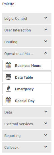
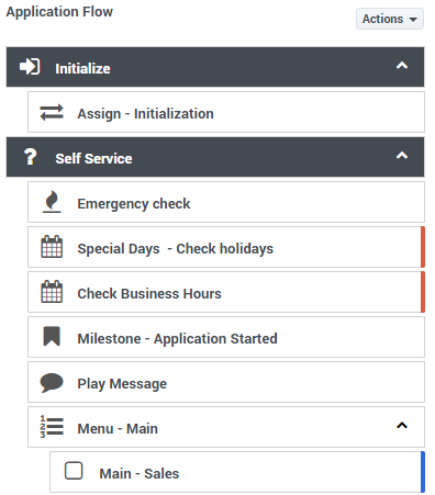
To build an application, you simply drag blocks from the Palette and drop them into the Application Flow, which is divided into phases and represents the application structure.
For example, you might use the following blocks in the Assisted Service phase, in which an agent helps a customer. The first block controls the announcement to the caller that they are being transferred, and the second block controls the routing function to an agent:
Before you start
Important!
Some of the features and functionality described in these topics might not be applicable to all deployments. Contact your Genesys representative if you have any questions about what is available in your version of Designer.
Supported browsers
Unless otherwise noted, Designer supports the latest versions of the following browsers:
- Mozilla Firefox
- Google Chrome (see Important, below)
- Microsoft Edge
- Apple Safari
Not supported: Internet Explorer (all versions)
Minimum display resolution
The minimum display resolution supported by Designer is 1920 x 1080.
Third-party cookies
Certain features in Designer require the use of third-party cookies. Browsers must allow third-party cookies to be stored for Designer to work properly.
Access the application[edit source]
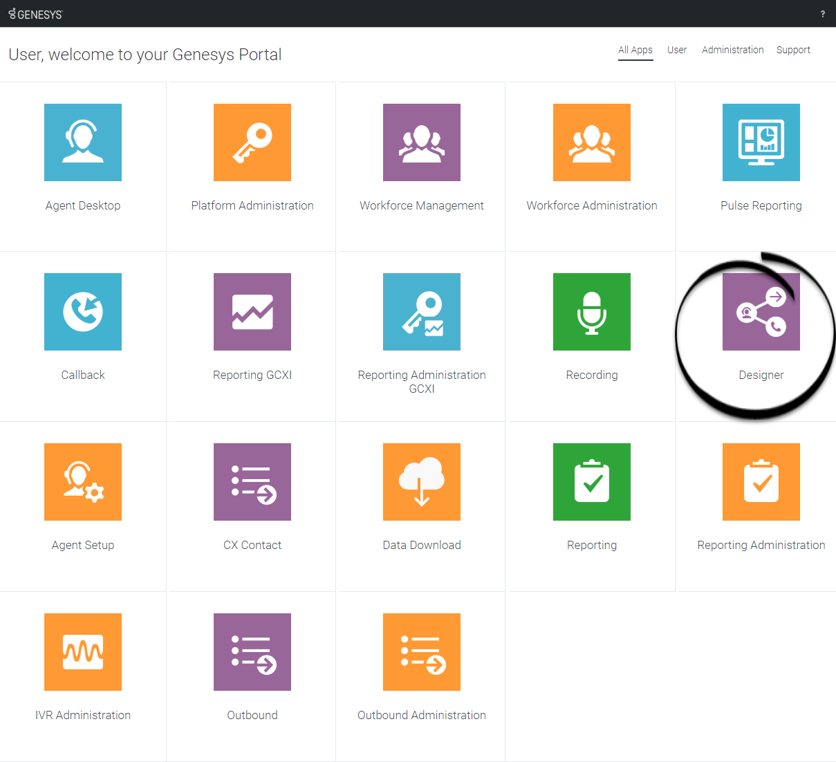
Once your Genesys Multicloud CX environment is up and running and you've checked that you meet the necessary requirements, log in to your Genesys Portal to access Designer. Click the Designer icon and enter your username and password.
Walk through the application
Watch this video to see an overview of the Designer user interface:
The various elements within the interface are described below.
Navigation bar
Provides one-click access to Applications, Shared Modules, Media Resources, Digital Resources, Speech Grammars, and Business Controls objects.
Workspace toolbar
Provides buttons for common actions. Click your user name to log off. Click the settings icon to view or modify the global Caching settings for certain resources and to toggle certain Features. Click the Help icon to access the Designer Help.
Application toolbar
Provides buttons for common actions. Click Settings to set global settings for your application. Click Save Flow to save and validate your application, or click Publish to save and validate your application and prepare it for use by routing engines. Click Build to create and manage the builds associated with the application.
Palette
Provides all available blocks that you can use in your application, sorted by functional grouping.
Actions toolbar
Many of the resource pages in Designer have an Actions toolbar. The action items on the toolbar will vary based on the resource page you are viewing. For more information, see Actions toolbar.
Application flow
Provides the main area to build your application by adding blocks. For more information, see Using the blocks.
Help pane
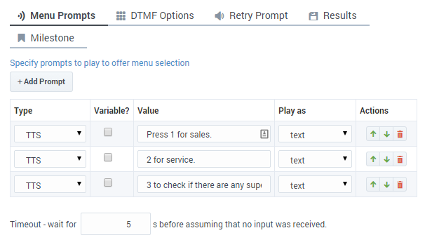
Block properties
Quick filters
This toolbar enables you to filter a list of resource items by selecting one or more filters that are associated with tags. The list then refreshes to show only those items that match the selected filters. For more information, see Using the Quick Filters.
Next steps
Use this page as a starting point to learn more about key Designer features and concepts:
More about Designer
This video highlights several of the new features and capabilities that were added to Designer during this past year (2021). It also shares a few customer success stories and offers a quick preview of what's ahead for Designer.


