Difference between revisions of "ATC/Current/AdminGuide/Content offers"
From Genesys Documentation
DannaShirley (talk | contribs) (Published) |
DannaShirley (talk | contribs) (Published) |
||
| Line 66: | Line 66: | ||
{{!}}{{!}}A description of the offer. Example: Book now and add discount code 123456 at the checkout to save 10%. | {{!}}{{!}}A description of the offer. Example: Book now and add discount code 123456 at the checkout to save 10%. | ||
{{!}}- | {{!}}- | ||
| − | {{!}}{{!}}'''Image''' | + | {{!}}{{!}}'''Image URL''' |
{{!}}{{!}}The URL that contains the image to be displayed in the offer. Example: <nowiki>https://images.com/myimage/</nowiki> | {{!}}{{!}}The URL that contains the image to be displayed in the offer. Example: <nowiki>https://images.com/myimage/</nowiki> | ||
| Line 103: | Line 103: | ||
{{!}}- | {{!}}- | ||
{{!}}{{!}}'''Offer text''' | {{!}}{{!}}'''Offer text''' | ||
| − | {{!}}{{!}}Style options for the heading, subheading, body, and call-to-action button: | + | {{!}}{{!}}Style options for the heading, subheading, body, and call-to-action button: |
*Font - By default, Genesys Widgets uses the Google font 'Roboto.' You can change the font or disable the Google font download, however. For more information, see {{Link-SomewhereInThisVersion|manual=Developer|topic=GWCCustomize|display text=Customize appearance}}. | *Font - By default, Genesys Widgets uses the Google font 'Roboto.' You can change the font or disable the Google font download, however. For more information, see {{Link-SomewhereInThisVersion|manual=Developer|topic=GWCCustomize|display text=Customize appearance}}. | ||
*Font size | *Font size | ||
*Text color | *Text color | ||
| − | *Text alignment | + | *Text alignment (*not available for call-to-action button) |
{{!}}- | {{!}}- | ||
| − | {{!}}{{!}}'''Button color''' | + | {{!}}{{!}}'''CTA Button color''' |
{{!}}{{!}}The call-to-action button color. <br /> | {{!}}{{!}}The call-to-action button color. <br /> | ||
{{!}}- | {{!}}- | ||
{{!}}{{!}}'''Close Button''' | {{!}}{{!}}'''Close Button''' | ||
{{!}}{{!}}The opacity and color of the Close (X) button that appears in the top right corner of the content | {{!}}{{!}}The opacity and color of the Close (X) button that appears in the top right corner of the content | ||
| + | {{!}}- | ||
| + | {{!}}'''Position''' | ||
| + | {{!}}The onscreen positioning of the content. | ||
{{!}}- | {{!}}- | ||
{{!}}{{!}}'''Padding''' | {{!}}{{!}}'''Padding''' | ||
{{!}}{{!}}The padding either in pixels or as a percentage. | {{!}}{{!}}The padding either in pixels or as a percentage. | ||
| − | |||
| − | |||
| − | |||
{{!}}} | {{!}}} | ||
|Status=No | |Status=No | ||
Revision as of 13:01, February 19, 2020
This topic is part of the manual Genesys Predictive Engagement Administrator's Guide for version Current of Genesys Predictive Engagement.
Contents
A content offer is a type of Altocloud action that triggers on a website when a user's behavior or segment matches to the criteria defined in an action map.
Prerequisites
- Configure the following permissions in PureCloud:
- Journey > Action Map > Add , Delete, Edit, and View permissions (to create action maps)
- Journey > Action Template > Add, Delete, Edit, and View permissions (to configure content offers)
Create the content offer
You create the content offer in the View content offers.
To create a content offer action:
- Go to Admin > Altocloud > Action Library.
- Click the Content offer tab.
- Click Create.
- On the Create Content Offer page, give the content offer a descriptive and meaningful name and description (for example, Spring Break Getaway Offer 2019).
- Next, define the content and design of your content offer, as described in the tables below.
Define the verbiage and visual styling
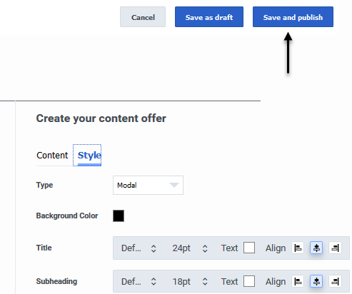
Use the Content and Style tabs to define all elements of a content offer. As you define the content and style parameters, click Refresh to preview the content offer.
Content options
| Option | Description |
| Layout | The layout of the text and image within the content offer:
|
| Heading | The prominent headline text. Example: Exclusive offer just for you! |
| Subheading | The secondary text to accompany the main heading. Example: Book now and get 10% off. |
| Body | A description of the offer. Example: Book now and add discount code 123456 at the checkout to save 10%. |
| Image URL | The URL that contains the image to be displayed in the offer. Example: https://images.com/myimage/
|
| Button text | A short string to be displayed inside the call-to-action button. Example: Book Now. |
| Destination URL | The destination URL. It's where the user is directed after clicking the image or call-to-action button. Note: The URL must contain the complete protocol URL address. Example: https://www.genesys.com |
| Open link in | The destination URL, either in the current window or in a new tab or window. |
Style options
| Option | Description |
| Type | Controls where the content offer appears on a web page and whether the user can interact with other web page elements while the content offer is onscreen.
|
| Background Color | The content offer's background color. |
| Offer text | Style options for the heading, subheading, body, and call-to-action button:
|
| CTA Button color | The call-to-action button color. |
| Close Button | The opacity and color of the Close (X) button that appears in the top right corner of the content |
| Position | The onscreen positioning of the content. |
| Padding | The padding either in pixels or as a percentage. |
Publish the content offer
When you finish creating the content offer, click Save and publish to publish the content offer and make it available for use by an action map.For more information, see Save an action: draft or publish.
Important
You can't edit an action once it's published, so if you're not ready to publish the content offer, click Save as draft. You can change the status from Draft to Published later on.Link the content offer to an action map
After you publish a content offer, you must link it to an action map in order for your users to see it. The action map defines the conditions that trigger the content offer. You can either create a new action map or use an existing one. In either case, you'll need to configure the following fields within the action map:
- In the Select action field, click Configure.
- Select Content offer.
- Click Next.
- On the Select content offer page, select the content offer.
- Click Next.
- On the Action summary page, review the details of your content offer, including the following:
- Activation time - Immediately, Upon return to site, or Delay.
- Time range - the start and end date of the content offer.
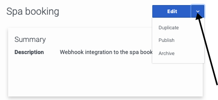
Manage a content offer
Once you've created a content offer, you can manage it in a number of ways:
Comments or questions about this documentation? Contact us for support!


