
Trending chart data description
Use the Trending chart to further analyze the relevance of a term/phrase, by studying the information panel that accompanies the Trending bubble chart.
By default the information shown underneath the chart shows data about the current Trending filter, and changes accordingly based on your selections and activities in the chart.
You can use the information panel to view statistical information about all interactions, or about a specific subset of interactions from your search results.
For detailed information about each option refer to:
Top terms/phrases
At the bottom of the bubble chart (as shown in the following image), there are two lists (Top # Terms and Top Movers). The two lists enable you to view the most frequently used terms/phrases during the selected time period and the terms/phrases with the highest change in frequency during the same time. For details, see the table below:

- Top Movers: Lists the terms/phrases that had the highest frequency change in the between Period 1 and Period 2. The red arrow indicates that the specific term/phrase appears less frequently and the green arrow indicates that it appears more frequently.
 Enables you to sort the term/phrase list to show all the terms/phrases, only those with a decrease in frequency, only those with an increase in frequency or only the terms/phrases that had no change.
 Enables you to view the frequency change as a percentage or a number.
- Top # Terms: The terms/phrases that stand out among the entire data set for the selected time period.
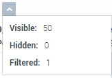 : Indicates the number of terms/phrases visible, hidden, and filtered (added to the Blacklist) in the Top # Terms list.
- Statistics:
- United: Indicates the number of terms/phrases that appear both in Period 1 and Period 2.
- Unique to Period 1: Indicates the number of terms/phrases that only appear in Period 1.
- Unique to Period 2: Indicates the number of terms/phrases that only appear in Period 2.
- Total Interactions: Indicates the number of terms/phrases that appear in Period 1 and the number of terms/phrases that appear in Period 2.
- Term List:
- Term: Indicates the term/phrase that appears in the interactions for the selected time periods.
- Highest: Indicates the highest frequency for the specific term/phrase among all of the interactions for the selected time periods.
- Count (P1): Indicates the number of times the specific term/phrase appeared in Period 1.
- Count (P2): Indicates the number of times the specific term/phrase appeared in Period 2.
- Rank (P1): Reveals the importance and prominence of the specific term in Period 1. The higher the number, the more prominent the term.
- Rank (P2): Reveals the importance and prominence of the specific term in Period 2. The higher the number, the more prominent the term.
- Visible: Indicates whether or not the specific term/phrase is visible in the bubble chart and information panel at the bottom of the chart.
 : Enables you to add/remove a column from the Term list table.
 : Enables you to view statistics about a term/phrase that is not shown in the bubble chart and list because it was added to the Blacklist. For example, the following image indicates that the term notes and its corresponding statistics will not appear in or be a part of the Trending chart because it was added to the Blacklist.

 : Enables you to hide or show all the terms/phrases from the chart. For example, if you select the Period 1 tab and hide all the terms/phrases, in the Comparison tab you will be able to view the terms/phrases that only appear in Period 2 and not in Period 1.
 : Enables you to search for a specific term/phrase within the Top # Terms list.

Term/Phrase drilldown
When you click one of the bubbles in the Trending chart, the information panel at the bottom of the screen changes (as shown in the following image) and shows trend data specifically about the selected term/phrase. For details, see the list below.

For example, in the above image the term tickets was selected.
- Interaction Trend: The bar graph shows changes over time in relation to how often the specific term/phrase was found. The graph shows the percentage of interactions that included the term/phrase in each period.
- Total Interactions: Indicates the number of interactions that contain the specific term/phrase out of all the interactions in the specific period.
- Trend: Indicates the frequency change for the selected term/phrase during the specified time period. The red arrow indicates that the specific term/phrase appears less frequently and the green arrow indicates that it appears more frequently.
- Similar Words: A list of the terms/phrases with the strongest correlation to the selected term/phrase. The list consists of terms/phrases spoken in the same context and therefore can be helpful in identifying topics in which the terms have been used. For example, synonyms and antonyms such as: answer, question, respond / calm, nervous, peaceful / costly, cheap, expensive and so on.