Callback
Contents
Learn how to use the Callback Widget to fetch user details.
Overview
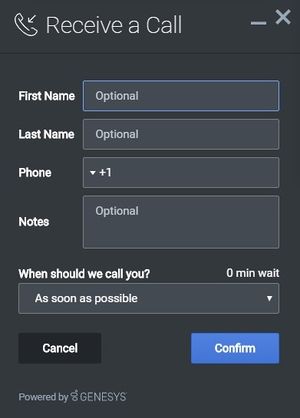
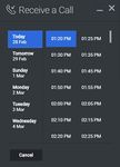
The Callback Widget provides a form to fetch user details such as name, phone number, and email—and whether the customer would like an immediate callback or would prefer to receive a call at another time of their choosing. Callback then submits this information to Customer Service. The times that Callback displays are based on agent availability, meaning the user can select a time that works for everyone.
Usage
Use the following methods to launch Callback manually:
- Call the Callback.open command
- Configure ChannelSelector so that Receive a Call appears as a channel
- Configure Calendar to show a Date-Time picker for selecting a preferred time
Dependency
The Callback Widget requires the Calendar plugin.
Customization
You can customize and localize all of the text shown in the Callback Widget by adding entries into your configuration and localization options.
Callback supports themes. You can create and register your own themes for Genesys Widgets.
Namespace
The Callback plugin has the following namespaces tied up with each of the following types:
| Type | Namespace |
|---|---|
| Configuration | callback |
| i18n—Localization | callback |
| CXBus— API commands & API events | Callback |
| CSS | .cx-callback |
Mobile support
Callback supports both desktop and mobile devices. Like all Genesys Widgets, there are two main modes: Desktop & Mobile. Desktop is employed for monitors, laptops, and tablets. Mobile is employed for smartphones. When a smartphone is detected, Callback switches to special full-screen templates that are optimized for both portrait and landscape orientations.
Switching between desktop and mobile mode is done automatically by default. You may configure Genesys Widgets to switch between Desktop and Mobile mode manually if necessary.
Screenshots
Dark theme
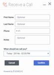
Light theme
Configuration
Callback and CallbackService share the _genesys.widgets.callback configuration namespace. Callback has UI options while CallbackService has connection options.
Example
window._genesys.widgets.callback = {

	apikey: 'n3eNkgXXXXXXXXOXXXXXXXXA',
	dataURL: 'http://host:port/genesys/1/service/callback/samples',
	userData: {},
	countryCodes: true,
	immediateCallback: true,
	scheduledCallback: true,
	ewt: {
		display: true,
		queue: 'chat_ewt_test',
		threshold: 2000,
		immediateCallback: {
			thresholdMin: 1000,
			thresholdMax: 3000
		}
	}
};
Options
| Name | Type | Description | Default | Required |
|---|---|---|---|---|
| countryCodes | boolean | Enable/disable display of country codes for phone number. | true | n/a |
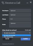
| immediateCallback | boolean | Enable/disable the immediate (As Soon As Possible) callback option. | true | n/a |
| scheduledCallback | boolean | Enable/disable the scheduling (Pick date & time) callback option. | true | n/a |
| form | object | An object containing a custom registration form definition. The definition placed here becomes the default registration form layout for Callback. See Customizable Callback Registration Form. | A basic registration form is defined internally by default | n/a |
| ewt.display | boolean | To display Estimated Wait Time (EWT) details. | true | n/a |
| ewt.queue | string | EWT service channel virtual queue. | none | Always required if Estimated Waiting Time has to be displayed. |
| ewt.threshold | number | If EWT is less than this threshold value (seconds), wait time will not be shown. | 30 | n/a |
| ewt.refreshInterval | number | EWT is updated for every time interval (seconds) defined here. | 10 | n/a |
| ewt.immediateCallback.thresholdMin | number | If EWT is less than this minimum threshold value (seconds), then 'As Soon As Possible' option (Immediate Callback) will be disabled. This value should be configured less than or equal to above ewt.threshold value. | none | n/a |
| ewt.immediateCallback.thresholdMax | number | If EWT is more than this maximum threshold value (seconds), then 'As Soon As Possible' option (Immediate Callback) will be disabled. | none | n/a |
Localization
Usage
Use the callback namespace when defining localization strings for the Callback plugin in your i18n JSON file.
The following example shows how to define new strings for the en (English) language. You can use any language codes you wish; there is no standard format. When selecting the active language in your configuration, you must match one of the language codes defined in your i18n JSON file. Please note that you must only define a language code once in your i18n JSON file. Inside each language object you should define new strings for each widget.
Example i18n JSON
{
	"en": {
		"callback": {
			"CallbackTitle": "Receive a Call",
			"CancelButtonText": "Cancel",
			"AriaCancelButtonText": "Cancel",
			"ConfirmButtonText": "Confirm",
			"AriaConfirmButtonText": "Confirm",
			"CallbackPlaceholderRequired": "Required",
			"CallbackPlaceholderOptional": "Optional",
			"CallbackFirstName": "First Name",
			"CallbackLastName": "Last Name",
			"CallbackPhoneNumber": "Phone",
			"CallbackQuestion": "When should we call you?",
			"CallbackDayLabels": [
				"Sunday",
				"Monday",
				"Tuesday",
				"Wednesday",
				"Thursday",
				"Friday",
				"Saturday"
			],
			"CallbackMonthLabels": [
				"Jan",
				"Feb",
				"Mar",
				"Apr",
				"May",
				"Jun",
				"Jul",
				"Aug",
				"Sep",
				"Oct",
				"Nov",
				"Dec"
			],
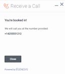
			"CallbackConfirmDescription": "You're booked in!",
			"CallbackNumberDescription": "We will call you at the number provided:",
			"CallbackNotes": "Notes",
			"CallbackDone": "Close",
			"AriaCallbackDone": "Close",
			"CallbackOk": "Okay",
			"AriaCallbackOk": "Okay",
			"CallbackCloseConfirm": "Are you sure you want to cancel arranging this callback?",
			"CallbackNoButtonText": "No",
			"AriaCallbackNoButtonText": "No",
			"CallbackYesButtonText": "Yes",
			"AriaCallbackYesButtonText": "Yes",
			"CallbackWaitTime": "Wait Time",
			"CallbackWaitTimeText": "min wait",
			"CallbackOptionASAP": "As soon as possible",
			"CallbackOptionPickDateTime": "Pick date & time",
			"AriaCallbackOptionPickDateTime": "Opens a date picker",
			"CallbackPlaceholderCalendar": "Select Date & Time",
			"AriaMinimize": "Callback Minimize",
			"AriaWindowLabel": "Callback Window",
			"AriaMaximize": "Callback Maximize",
			"AriaClose": "Callback Close",
			"AriaCalendarClosedStatus": "Calendar is closed",
			"Errors": {
				"501": "Invalid parameters cannot be accepted, please check the supporting server API documentation for valid parameters.",
				"503": "Missing apikey, please ensure it is configured properly.",
				"1103": "Missing apikey, please ensure it is configured properly.",
				"7030": "Please enter a valid phone number.",
				"7036": "Callback to this number is not possible. Please retry with another phone number.",
				"7037": "Callback to this number is not allowed. Please retry with another phone number.",
				"7040": "Please configure a valid service name.",
				"7041": "Too many requests at this time.",
				"7042": "Office closed. Please try scheduling within the office hours.",
				"unknownError": "Something went wrong, we apologize for the inconvenience. Please check your connection settings and try again.",
				"phoneNumberRequired": "Phone number is required."
			}
		}
	}
}
API commands
Once you've registered your plugin on the bus, you can call commands on other registered plugins. Here's how to use the global bus object to register a new plugin on the bus.
var oMyPlugin = window._genesys.widgets.bus.registerPlugin('MyPlugin');

oMyPlugin.command('Callback.open');
open
Opens the Callback UI.
Example
oMyPlugin.command('Callback.open', {

	form: {

		autoSubmit: false,
		firstname: 'John',
		lastname: 'Smith',
		subject: 'Customer Satisfaction',
		desiredTime: 'now',
		phonenumber: '8881110000'
	},
	formJSON: {...}

}).done(function(e){

	// Callback opened successfully

}).fail(function(e){

	// Callback failed to open
});
Options
| Option | Type | Description |
|---|---|---|
| form | object | Object containing form data to prefill in the callback form and optionally auto-submit the form. |
| form.autoSubmit | boolean | Automatically submit the callback form. |
| form.firstname | string | Value for the first name entry field. |
| form.lastname | string | Value for the last name entry field. |
| form.subject | string | Value for the notes entry field. |
| form.desiredTime | string | This value is shared by the immediate or scheduled callback drop down option in the form (in other words, As Soon As Possible or Pick date & time). A string value 'now' pre-selects the 'As Soon As Possible' option. A string value with Date Time or Date Object, is passed into this drop down option and pre-selected. During form submission, it is converted into UTC string format and sent to the server as the desired callback time. |
| form.phonenumber | string | Value for the phone entry field. Should be a valid telephone number, when used with a prefix '+' auto selects the country flag near the phone input field. |
| formJSON | object | An object containing a custom registration form definition. See Customizable Callback Registration Form. |
| userData | object | Arbitrary data that is to be attached with callback schedule. Properties defined here will be merged with default userData set in the configuration object. |
Resolutions
| Status | When | Returns |
|---|---|---|
| resolved | Callback form is successfully opened | n/a |
| rejected | Callback form is already open | 'already opened' |
close
Closes the Callback UI.
Example
oMyPlugin.command('Callback.close');Resolutions
| Status | When | Returns |
|---|---|---|
| resolved | Callback form is successfully closed | n/a |
| rejected | Callback form is already closed | 'already closed' |
| rejected | User has entered some details on the form and trying to close it without confirming cancellation | 'User must confirm close' |
minimize
Minimizes or un-minimizes the Callback UI.
Example
oMyPlugin.command('Callback.minimize');Options
| Option | Type | Description |
|---|---|---|
| minimized | boolean | Rather than toggling the current minimized state you can specify the minimized state directly: true = minimized, false = unminimized. |
Resolutions
| Status | When | Returns |
|---|---|---|
| resolved | Always | n/a |
| rejected | Never | n/a |
showOverlay
Displays a slide-down overlay over the Callback's content. You can fill this overlay with disclaimers, articles and other information.
Example
oMyPlugin.command('Callback.showOverlay', {

	html: '<div>Example text</div>'

});
Options
| Option | Type | Description |
|---|---|---|
| html | string or HTML reference | The HTML content you want to display in the overlay. |
| hideFooter | boolean | Normally the overlay appears between the titlebar and footer bar. Set this to true to have the overlay overlap the footer to gain a bit more vertical space. This should only be used in special cases. For general use, don't set this value. |
Resolutions
| Status | When | Returns |
|---|---|---|
| resolved | Callback is open and the overlay opens | n/a |
| rejected | Callback is not currently open | Callback is not currently open. Ignoring command. |
hideOverlay
Hides the slide-down overlay.
Example
oMyPlugin.command('Callback.hideOverlay');Resolutions
| Status | When | Returns |
|---|---|---|
| resolved | Callback is open and the overlay closes | n/a |
| rejected | Callback is not currently open | Callback is not currently open. Ignoring command. |
configure
Internal use only. The main App plugin shares configuration settings to widgets using each widget’s configure command. The configure command can only be called once at startup. Calling configure again after startup may result in unpredictable behavior.
API events
Once you've registered your plugin on the bus, you can subscribe to and listen for published events. Here's how to use the global bus object to register a new plugin on the bus.
var oMyPlugin = window._genesys.widgets.bus.registerPlugin('MyPlugin');

oMyPlugin.subscribe('Callback.ready', function(e){});| Name | Description | Data |
|---|---|---|
| opened | The Callback widget has appeared on screen. | Metadata |
| ready | Callback is initialized and ready to accept commands. | n/a |
| started | When the user has started filling out the Callback widget form or auto pre-filled it. | Metadata |
| submitted | When the user has submitted the form. | Metadata |
| completed | When the Callback widget form is submitted successfully. | Metadata |
| cancelled | When the user has abandoned the interaction by closing the Callback widget before scheduling a callback. | Metadata |
| closed | The Callback widget has been removed from the screen. | Metadata |
Metadata
Interaction Lifecycle
Every Callback interaction has a sequence of events we describe as the Interaction Lifecycle. This is a sequence of events that tracks progress and choices from the beginning of an interaction (opening Callback), to the end (closing Callback), and every step in between.
The following events are part of the Interaction Lifecycle:
ready
opened
started
submitted
cancelled
completed
closed
Lifecycle scenarios
An Interaction Lifecycle can vary, based on each user's intent and experience with Callback. Here are several sequences of events in the lifecycle that correspond to different scenarios.
The user opened Callback but changed their mind and closed it without entering any information:
ready -> opened -> cancelled -> closed
The user started filling out the form but closed Callback without submitting the callback request:
ready -> opened -> started -> cancelled -> closed
The user started filling out the form and submitted it successfully:
ready -> opened -> started -> submitted -> completed -> closed
Metadata
Each event in the Interaction Lifecycle includes the following block of metadata. By default, all values are set to false. As the user progresses through the lifecycle of a Callback interaction, these values will be updated.
The metadata block contains boolean state flags, counters, timestamps, and elapsed times. These values can be used to track and identify trends or issues with callback interactions. During run-time, the metadata can help you offer a smart and dynamic experience to your users.
Reference
| Name | Type | Description |
|---|---|---|
| proactive | boolean | Indicates Callback was offered and accepted proactively. |
| prefilled | boolean | Indicates the form was prefilled with info automatically. |
| autoSubmitted | boolean | Indicates the form was submitted automatically, usually after being prefilled. |
| errors | array/boolean | An array of error codes encountered after submitting the form. If no errors, this value will be false. |
| form | object | An object containing the form parameters when the form is submitted. |
| opened | integer (timestamp) | Timestamp indicating when Callback was opened. |
| started | integer (timestamp) | Timestamp indicating when the user started entering information into the form. |
| cancelled | integer (timestamp) | Timestamp indicating when the callback request is cancelled. Cancelled refers to when a user abandoned the interaction by closing Callback before scheduling a callback. |
| completed | integer (timestamp) | Timestamp indicating when the callback request was sent successfully. |
| closed | integer (timestamp) | Timestamp indicating when Callback was closed. |
| elapsed | integer (milliseconds) | Total elapsed time in milliseconds from when the user started entering information to when the user cancelled or completed the interaction. |
Customizable Callback registration form
Callback allows you to customize the registration form shown to users prior to starting a session. The following form inputs are currently supported:
- Text
- Select
- Hidden
- Checkbox
- Textarea
Customization is done through an object definition that defines the layout, input type, label, and attributes for each input. You can set the default registration form definition in the _genesys.widgets.callback.form configuration option. Alternately, you can pass a new registration form definition through the Callback.open command:
_genesys.widgets.bus.command("Callback.open", {formJSON: oRegFormDef});Inputs are rendered as stacked rows with one input and one optional label per row.
Default example
The following example is the default object used to render Callback's registration form. This is a very simple definition that does not use many properties.
{
	wrapper: "<table></table>",
	inputs: [

		{
                        id: "cx_form_callback_firstname",
                        name: "firstname",
                        maxlength: "100",
                        placeholder: "@i18n:callback.CallbackPlaceholderOptional",
                        label: "@i18n:callback.CallbackFirstName"
                    },

                    {
                        id: "cx_form_callback_lastname",
                        name: "lastname",
                        maxlength: "100",
                        placeholder: "@i18n:callback.CallbackPlaceholderOptional",
                        label: "@i18n:callback.CallbackLastName"
                    },

                    {
                        id: "cx_form_callback_phone_number",
                        name: "phonenumber",
                        maxlength: "14",
                        placeholder: "@i18n:callback.CallbackPlaceholderRequired",
                        label: "@i18n:callback.CallbackPhoneNumber",

                        onkeypress: function(event) {

                                // To allow only number inputs
                        	return (event.charCode >= 48 && event.charCode <= 57) || (event.charCode == 43)
                        }
                    },

                    {
                        id: "cx_form_callback_subject",
                        name: "subject",
                        type: "textarea",
                        maxlength: "100",
                        placeholder: "@i18n:callback.CallbackPlaceholderOptional",
                        label: "@i18n:callback.CallbackNotes"
                    }
	]
}
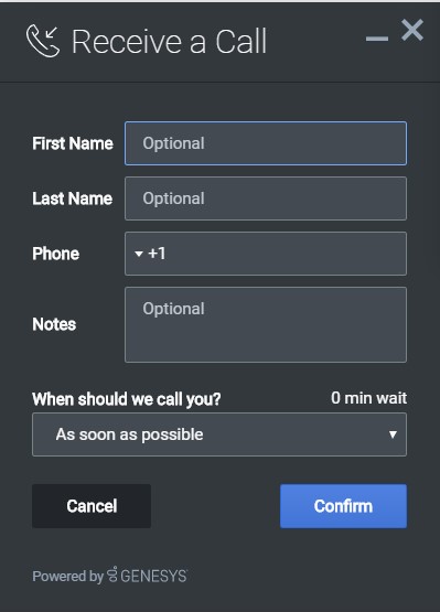
Using this definition will result in this output:
Properties
Each input definition can contain any number of properties. These are categorized in two groups: Special Properties, which are custom properties used internally to handle rendering logic, and HTML Attributes which are properties that are applied directly as HTML attributes on the input element.
Special properties
| Property | Type | Default | Description |
|---|---|---|---|
| type | string | "text" | Sets the type of input to render. Possible values are currently text, hidden, select, checkbox, and textarea.
|
| label | string | Set the text for the label. If no value provided, no label will be shown. You may use localization query strings to enable custom localization (for example, label: "@i18n:namespace.StringName"). Localization query strings allow you to use strings from any widget namespace or to create your own namespace in the localization file (i18n.json) and use strings from there (for example, label: "@i18n:myCustomNamespace.myCustomString001"). For more information, see the Labels section. | |
| wrapper | HTML string | “<table></table>” | Each input exists in its own row in the form. By default this is a table-row with the label in the left cell and the input in the right cell. You can redefine this wrapper and layout by specifying a new HTML row structure. See the Wrappers section for more info. The default wrapper for an input is " |
| validate | function | Define a validation function for the input that executes when the input loses focus (blur) or changes value. Your function must return true or false. True to indicate it passed, false to indicate it failed. If your validation fails, the form will not submit and the invalid input will be highlighted in red. See the Validation section for more details and examples.
| |
| validateWhileTyping | boolean | false | Execute validation on keypress in addition to blur and change. This ignores non-character keys like shift, ctrl, and alt. |
| options | array | [] | When ‘type’ is set to ‘select’, you can populate the select by adding options to this array. Each option is an object (for example, {name: ‘Option 1’, value: ‘1’} for a selectable option, and {name: "Group 1", group: true} for an option group). |
HTML attributes
With the exception of special properties, all properties will be added as HTML attributes on the input element. You can use standard HTML attributes or make your own.
Example
{
	id: "cx_callback_form_firstname",
	name: "firstname",
	maxlength: "100",
	placeholder: "@i18n:callback.CallbackPlaceholderOptional",
	label: "@i18n:callback.CallbackFirstName"
}
In this example, id, name, maxlength, and placeholder are all standard HTML attributes for the text input element. Whatever values are set here will be applied to the input as HTML attributes.
Note: the default input type is "text", so type does not need to be defined if you intend to make a text input.
HTML output
<input type="text" id="cx_callback_form_firstname" data-origID="cx_callback_form_firstname" name="firstname" maxlength="100" placeholder="Optional"></input>Labels
A label tag will be generated for your input if you specify label text and if your custom input wrapper includes a ‘{label}’ designation. If you have added an ID attribute for your input, the label will automatically be linked to your input so that clicking on the label selects the input or, for check boxes, toggles it.
Labels can be defined as static strings or localization queries.
Wrappers
Wrappers are HTML string templates that define a layout. There are two kinds of wrappers, form wrappers and input wrappers:
Form wrapper
You can specify the parent wrapper for the overall form in the top-level "wrapper" property. In the example below, we specify this value as " ". This is the default wrapper for the Callback form.
{
	wrapper: "<table></table>", /* form wrapper */
	inputs: []
}
Input wrapper
Each input is rendered as a table row inside the form wrapper. You can change this by defining a new wrapper template for your input row. Inside your template you can specify where you want the input and label to be by adding the identifiers "{label}" and "{input}" to your wrapper value. See the example below:
{
	id: "cx_callback_form_firstname",
	name: "firstname",
	maxlength: "100",
	placeholder: "@i18n:callback.CallbackPlaceholderOptional",
	label: "@i18n:callback.CallbackFirstName"
	wrapper: "<tr><th>{label}</th><td>{input}</td></tr>" /* input row wrapper */
}
The {label} identifier is optional. Omitting it will allow the input to fill the row. If you decide to keep the label, you can move it to any location within the wrapper, such as putting the label on the right, or stacking the label on top of the input. You can control the layout of each row independently, depending on your needs.
You are not restricted to using a table for your form. You can change the form wrapper to "<div></div>" and then change the individual input wrappers from a table-row to your own specification. Be aware though that when you move away from the default table wrappers, you are responsible for styling and aligning your layout. Only the default table-row wrapper is supported by default Themes and CSS.
Validation
You can apply a validation function to each input that lets you check the value after a change has been made and/or the user has moved to a different input (on change and on blur). You can enable validation on key press by setting validateWhileTyping to true in your input definition.
Here is how a validation function is defined:
{
	id: "cx_callback_form_firstname",
	name: "firstname",
	maxlength: "100",
	placeholder: "@i18n:callback.CallbackPlaceholderOptional",
	label: "@i18n:callback.CallbackFirstName"

	validateWhileTyping: true, // default is false

	validate: function(event, form, input, label, $, CXBus, Common){

                if(input && input.val()) {    // to validate some input exits in the firstname input field (required field)

                    return true;              // validation passed

                }else{

		    return false;             // no input exists, validation failed
                }
	}
}
You can perform any validation you like in the validate function but it must return true or false to indicate that validation has passed or failed, respectively. If you return false, the Callback form will not submit, and the input will be highlighted in red. This is achieved by adding the CSS class "cx-error" to the input.
Validation function arguments
| Argument | Type | Description |
|---|---|---|
| event | JavaScript event object | The input event reference object related to the form input field. This event data can be helpful to perform actions like active validation on an input field while the user is typing. |
| form | HTML reference | A jquery reference to the form wrapper element. |
| input | HTML reference | A jquery reference to the input element being validated. |
| label | HTML reference | A jquery reference to the label for the input being validated. |
| $ | jquery instance | Widget’s internal jquery instance. Use this to help you write your validation logic, if needed. |
| CXBus | CXBus instance | Widget’s internal CXBus reference. Use this to call commands on the bus, if needed. |
| Common | Function Library | Widget’s internal Common library of functions and utilities. Use if needed. |
Form submit
Custom input field form values are submitted to the server as key value pairs in the form submit request, where the input field names are the property keys and the input field values are the property values.
Form pre-fill
You can pre-fill the custom form using the Callback.open command by passing the form (form data) and formJSON (custom registration form), provided the form input names in the formJSON must match with the property names in the form data.
The following example will open the Callback form with the phone number already entered in the Phone input field.
_genesys.widgets.bus.command("Callback.open", {

	formJSON: {
   		wrapper: "<table>",
    		inputs: [{
            		id: "cx_form_phone_number",
            		name: "phonenumber",
            		maxlength: "12",
            		placeholder: "@i18n:callback.CallbackPlaceholderPhoneNumber",
            		label: "@i18n:callback.CallbackPhoneNumber"
        		}]
	},

	form: {
		phonenumber: 9453222222
	}
});

