Widget Types
Contents
Types of widgets that you can add to your Genesys Pulse dashboard or wallboard.
The widgets on the Genesys Pulse dashboard display charts that provide an at-a-glance view of what is happening in your contact center. The best way to choose a report widget type is to preview the widget when you add a new widget. This allows you to see which widget type best displays what you want to see in your report. The Text widget is created from the Text Widget template and the Alert widget is created from Alert Widget template.
Alert widget
Donut Widget
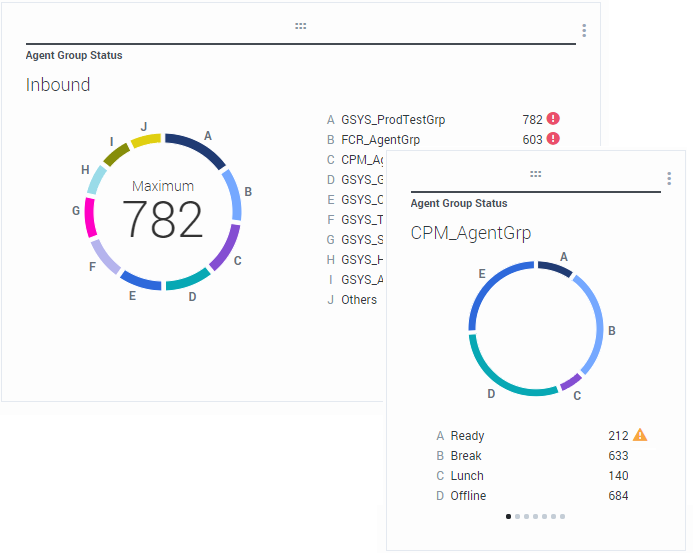
A Donut chart shows a proportional representation of the parts of a whole sample, similar to a pie chart.
The Donut widget displays either:
- One statistic for up to ten specific objects. If more than 10 objects are defined, the widget displays specific values for nine of them and summarized Others value for the rest.
- One object with the values of up to ten defined statistics.
Depending on the reference selected in the Cycle By option, a carousel can be defined to display additional several items.
The Total, Average, Maximum, Minimum, or no value can be displayed in the center of the Donut widget.Grid Widget
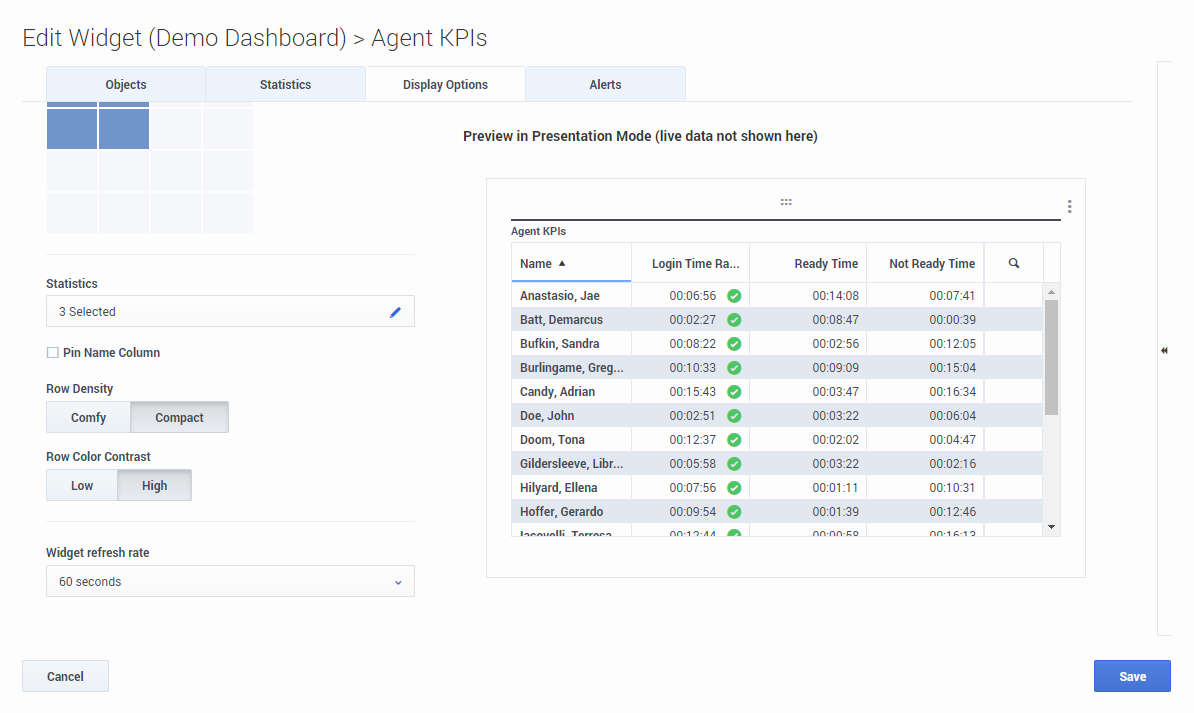
The Grid widget displays a list of items and their related statistics.
Starting with release 9.0.001, new options are available on the Display Options tab of the Widget Wizard for the Grid widget:
- Row Density:
- Comfy (default) or Compact
- Row Color Contrast:
- Low (default) or High
KPI Widget
Dashboard KPI Widget
The dashboard KPI widget displays either one statistic for several objects or several statistics for one object, depending on the value of the Cycle By option. The Cycle By option is available if the widget has objects selected individually, not by group.
Wallboard KPI Widget
The wallboard KPI widget is different from the dashboard KPI widget. The Wallboard KPI widget displays only one statistic for one selected object and is designed for large screen sizes. You can choose only between a regular or sparkline widget.
You can enable an additional line for a statistic trend if you change the Format option to Sparkline.Line Chart
List Widget
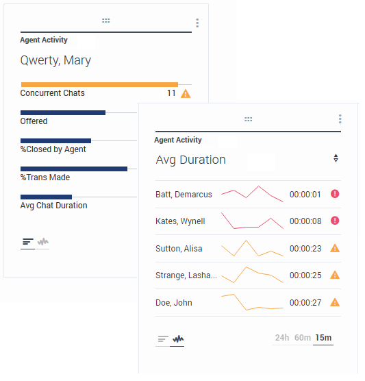
The List widget displays either one statistic for many objects or many statistics for one object. Depending on the reference selected, the Headline type option might be available for this widget type.
The maximum value for the bar charts in List widgets is the maximum value of all the objects selected for the statistic in this widget or the maximum value of the alert configured for this widget.For example, if a statistic has the historical values:
10, 10, 10, 10, Error, Error, Error, 50, 50, Null, 10.
The chart values may be drawn on a straight line as:
10, 10, 10, 10, 20, 30, 40, 50, 50, 30, 10.Text widget
The Text widget is created from the Text Widget template.
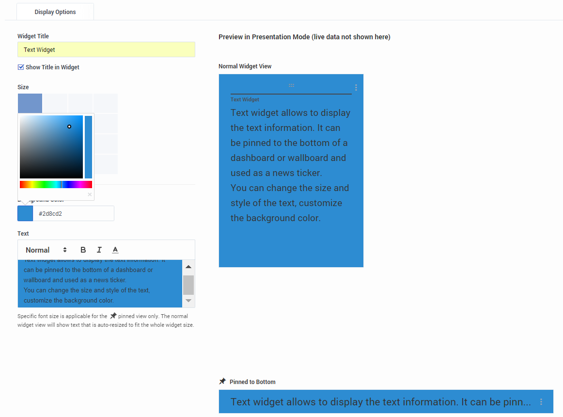
Starting with release 8.5.108, Genesys Pulse includes the ability to display broadcast information to its audience with a text widget type. The text widget can be displayed as a news feed ticker and edited by Administrators.
Starting with release 9.0.001, you can change the size, color, and style of the text and customize the background color. When created on a wallboard, text widget, by default, inherits the current wallboard's theme in the full-screen mode.


