View model accuracy
View how well your model is performs over time, how accurate your model was when trained, and feature coverage.
The Model Accuracy tab
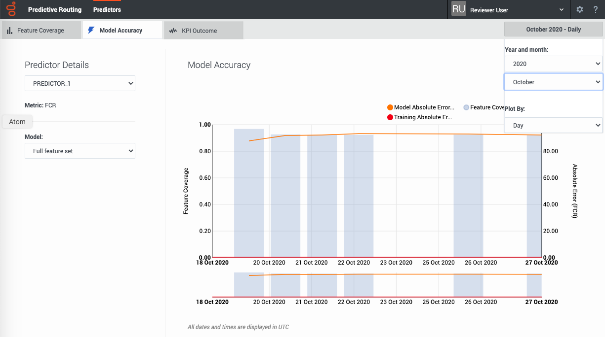
The Model Accuracy tab enables you to select the following information:
- The name and ID of the predictor. Use the selector to specify which predictor to view.
- The name and ID of the model. Use the selector to specify which model to view.
- The displayed date range. Use the year and month selectors to specify the month to view.
- The Plot By selector enables you to set the granularity with which the graph displays data. You can choose to view data by Day, Hour, or 15-Minute interval.
Note: This page does not display real-time updates. GPR refreshes the data displayed once per day, at 3:00 am UTC.
How to read the graph
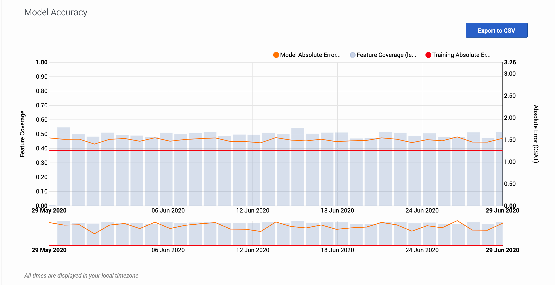
The graph also includes a horizontal line marking the accuracy level when the model was trained, enabling you to compare the training result with real-world performance. The gray bars show the feature coverage level, since feature coverage issues are often the reason for degradations in model accuracy.
Note: If feature coverage does seem to be the source of a model's drift away from accuracy, use the Feature Coverage tab to troubleshoot issues. To view the features ranked by strongest impact on the KPI value, see the Top Features horizontal bar graph on the Feature Coverage tab.
Example
When you view the graph, keep in mind that the vertical axis on the right shows the mean absolute error rate, not the actual KPI value. The example image on this page shows the graph for a model designed to optimize CSAT. The horizontal red training line shows that when you created the model, it had an error rate of 1.26. That is, the average difference between the predicted CSAT and the actual CSAT was 1.26 points. As you have used this model over time, this difference between the predicted CSAT and the actual CSAT has ranged from 1.40 to 1.56.
To export the model accuracy data as a .csv file, click the Export to CSV button.


