Monitor predictor feature coverage
Contents
Gain insight into your Machine Learning model performance factors to ensure you always get the best predictions.
The Feature Coverage tab
The Feature Coverage tab enables you to select the following information:
- The name and ID of the predictor. Use the selector to specify which predictor to view.
- The name and ID of the model. Use the selector to specify which model to view.
- The displayed date range. Use the year and month selectors, on the right side of the window, to specify the month to view.
- The granularity—Day, Hour, or 15 minutes—at which the data is displayed on the dials and on the Trends window that opens when you click one of the dials.
Note: This page does not display real-time updates. GPR refreshes the data displayed once per day, at 3:00 am UTC.
How to read the dials
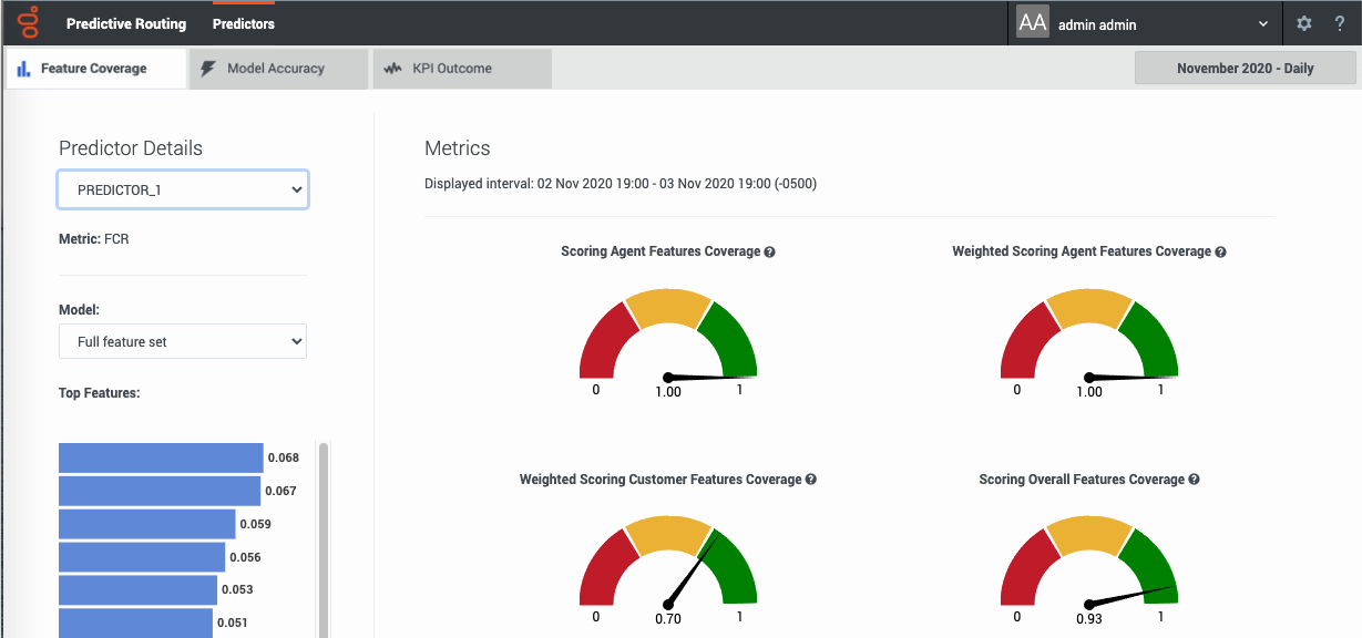
 The Feature Coverage tab presents six dials, each with a range of 0-1, which indicates the percent coverage of the specified performance factor. The number below the dial corresponds with the point indicated by the needle on the dial. That is, a dial setting of 0.59, as shown in the graphic, equals 59%.
Note: If the window displays no agent feature dials, there are no agent features present in the selected model.
The dials are colored red, yellow, and green to provide a quick visual indicator of whether the feature coverage for the associated parameter is satisfactory. Green indicates that you have good coverage, yellow means that you should review your coverage quality, and red indicates that coverage is not adequate and you should take action to improve predictor performance.
Metrics definitions
Feature coverage scores
Three of the dials show the percentage of features available when the selected model was trained that are also in the actual data used for scoring. One shows agent features, one customer features, and one shows the result for all features taken together.
The values range from 0 to 1, with higher being better. If all features in the training dataset used to create the model are also in the data used for scoring, the value is 1. A lower value shows that some data you expect might no longer be available.
If, over time, feature coverage drops but weighted feature coverage holds steady, the data in the missing features might be of low value in any case, since the weighted coverage value gives emphasis to the features with the highest impact on the KPI configured in the predictor.
Weighted feature coverage scores
The remaining three dials also show the percentage of features available when the selected model was trained that are also in the actual data used for scoring, but with that figure adjusted to weigh the most significant features higher.
- To view the feature weighting, see the bar graph showing the top features on the left side of this window.
As a result of the weighting, if coverage is good for very significant features but poor for insignificant ones, the weighted result is still good. However, even if feature coverage is good for most features, if it is poor for one or more significant features, the weighted result is poor. As a result, coverage can appear good on the non-weighted dials and poor on the weighted ones.
In these dials also, the values range from 0 to 1, with higher being better.
If weighted feature coverage drops but feature coverage is steady, the small amount of missing data must disproportionately affect key features.
View feature coverage trends
The feature coverage dials show data for the selected month period. To view feature coverage trends over the selected time, follow these steps:
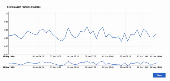
- Click any of the six dials. A Trends window opens, with a graph showing all data points for the metric you clicked during the month you selected on the main window. The data points reflect the granularity selected in the Plot By field.
- To show a shorter period of time within the month, click the blue selector line below the main chart. This activates a slider function, enabling you to narrow the time period shown on the upper Trend graph. This
- Hover your mouse over the Trend line to open a tooltip showing the exact date and feature coverage value for that point on the line.


