SideBar
Contents
Learn about the Sidebar widget, which customers use to launch other widgets with a single click.
Overview
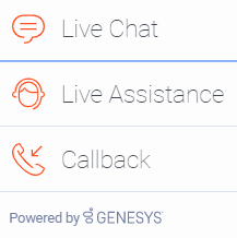
Use the SideBar to launch other widgets with a single click. By default, SideBar is displayed on the right side of the screen, and you can configure any launchable widgets onto SideBar, including your custom extension widgets. The SideBar UI expands when you hover your cursor over it, and contracts when you move the cursor away. Other features include configurable positioning and mobile support. You can also add new configurations on the fly, which automatically re-renders the SideBar.
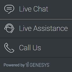
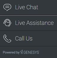
The image on the left shows SideBar when it is initially loaded, while the one on the right shows what it looks like when it's expanded.
Usage
Use the following methods to launch SideBar manually:
Dependency
You must configure at least one customer-facing UI widget in order to use the SideBar Widget.
Customization
You can customize and localize all the text shown in the SideBar Widget by adding entries to your configuration and localization options.
SideBar also supports themes. You can create and register your own themes for Genesys Widgets.
Namespace
The SideBar plugin has the following namespaces tied to each of the following types:
| Type | Namespace |
|---|---|
| Configuration | sidebar |
| i18n - Localization | sidebar |
| CXBus -API commands & API events | SideBar |
| CSS | .cx-sidebar |
Mobile support
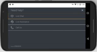
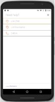
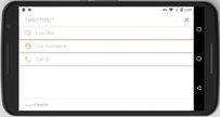
SideBar supports both desktop and mobile devices. In mobile mode, the SideBar launcher button displays at the bottom of the screen. When triggered, it expands to the full screen of the mobile device and shows all channels configured with a scrollbar when necessary. Like all Genesys Widgets, there are two main modes: desktop and mobile. Desktop is for monitors, laptops, and tablets, and mobile is for smartphones. When a smartphone is detected, SideBar switches to special full-screen templates that are optimized for both portrait and landscape orientations.
Switching between desktop and mobile mode is done automatically by default. You may configure Genesys Widgets to switch between desktop and mobile mode manually if necessary.
Screenshots
Dark theme
Light theme
Configuration
SideBar shares the _genesys.widgets.sidebar configuration namespace. SideBar has UI options to handle its position on the screen, disable the expand feature, hide SideBar, and add new channels on the fly. The order of channels that display is based on the order defined in the channel's configuration array.
Example
window._genesys.widgets.sidebar = {

	showOnStartup: true,

	position: 'left',

	expandOnHover: true,

	channels: [{

			name: 'ChannelSelector',
			clickCommand: 'ChannelSelector.open',
			clickOptions: {},

			 //use your own static string or i18n query string for the below two display properties
			displayName: 'Live Assist',
			displayTitle: 'Get live help',

			icon: 'agent'
		},

		{
			name: 'WebChat'
		}
	]
};
Options
| Name | Type | Description | Default | Required |
| channels[index].clickCommand | string | Change the default command that is triggered when clicked. | n/a | false |
| channels[index].clickOptions | object | Pass valid command options that are used in above click command execution. | n/a | n/a |
| channels[index].displayName | string or i18n query string | Change the default display name for this channel with your own static string or to achieve localization, use i18n query string. Syntax: @i18n:<plugin namespace>.<display key> | n/a | false |
| channels[index].displayTitle | string or i18n query string | Change the default tooltip content for this channel with your own static string or to achieve localization, use i18n query string. Syntax: @i18n:<plugin namespace>.<display key> | n/a | false |
| channels[index].icon | string | Change the default icon for this channel. For the list of icon names see Customize icons in Customize appearance. | n/a | false |
| channels[index].name | string | Name of the channel. It can be found in the namespace section documentation of each widget. Used to identify official channels vs custom channels. If a reserved name is used here, SideBar will apply default values for that channel. A plugin name defined in the new custom plugin can also be given here. To override the default values or when defining a new custom channel/plugin, use the below following properties. | n/a | true |
| channels[index].onClick | function | Define a custom onclick function; this overrides clickCommand and clickOptions. | n/a | false |
| channels[index].readyEvent | string | Subscribes to this ready event published by a plugin. | n/a | false |
| expandOnHover | boolean | Enables the expand (slide-out) or contract (slide-in) behavior of SideBar. | true | false |
| position | string | Defines the position of SideBar on the screen. Acceptable values are left or right.
|
right | false |
| showOnStartup | boolean | Shows the SideBar on the screen when Widgets is launched. | true | false |
Localization
Strings
{
	"SidebarTitle": "Need help?",
	"ChannelSelectorName": "Live Assistance",
	"ChannelSelectorTitle": "Get assistance from one of our agents right away",
	"CallUsName": "Call Us",
	"CallUsTitle": "Call Us details",
	"WebChatName": "Live Chat",
	"WebChatTitle": "Live Chat",
	"AriaClose": "Close the menu Need help"
}
API commands
var oMyPlugin = window._genesys.widgets.bus.registerPlugin('MyPlugin');

oMyPlugin.command('SideBar.open');
configure
Internal use only. The main App plugin shares configuration settings to widgets using each widget’s configure command. The SideBar Widget has to be configured at minimum with one channel. The configure command can also be called at runtime with a new configuration, which will override the existing configuration, showing new channels on screen.
Example
oMyPlugin.command('SideBar.configure', {

	showOnStartup: false,
	position: 'left',
	expandOnHover: false,
	channels: [
		{
			name: 'ChannelSelector',
			clickCommand: 'ChannelSelector.open',
			clickOptions: {},

			  /* use your own static string or i18n query string for the below two display properties. Example for i18n query string: '@i18n:sidebar.ChannelSelectorName' where 'sidebar' refers to plugin namespace and ChannelSelectorName' name refers to the property key containing the actual text.*/

			displayName: '@i18n:sidebar.ChannelSelectorName',
			displayTitle: 'Get assistance from one of our agents right away', // Your own static string
			readyEvent: 'ChannelSelector.ready',
			icon: 'agent',
			onClick: function($, CXBus, Common) {
				_genesys.widgets.bus.command('MyPlugin.open');
			}
		}
		...
	]

}).done(function(e){

	// Sidebar configured successfully

}).fail(function(e){

	// Sidebar failed to configure properly
});
Options
| Option | Type | Description |
| showOnStartup | boolean | Shows SideBar on the screen when Widgets is launched. |
| position | string | Defines the position of SideBar on the screen. |
| expandOnHover | boolean | Enables the expand or contract behavior of SideBar. |
| channels | array | Array containing each channel configuration object. The order of channels is displayed based on the order defined here. |
| channels[index].name | string | Name of the channel. It can be found in the Namespace section documentation of each widget. Used to identify official channels vs custom channels. If a reserved name is used here, SideBar will apply default values for that channel. To override the default values or when defining a new custom channel, use the below following properties. |
| channels[index].clickCommand | string | Change the default command that is triggered when clicked. |
| channels[index].clickOptions | object | Pass valid command options that are used in above click command execution. |
| channels[index].displayName | string or i18n query string | Change the default display name for this channel with your own static string or to achieve localization, use i18n query string. Syntax: @i18n:<plugin namespace>.<display key>. |
| channels[index].displayTitle | string or i18n query string | Change the default tooltip content for this channel with your own static string or to achieve localization, use i18n query string. Syntax: @i18n:<plugin namespace>.<display key>. |
| channels[index].readyEvent | string | Subscribes to this ready event published by a plugin. |
| channels[index].icon | string | Change the default icon for this channel. For the list of icon names, see Customize icons in the Customize appearance guide. |
| channels[index].onClick | function | Define a custom onclick function, which overrides clickCommand and clickOptions. |
API events
var oMyPlugin = window._genesys.widgets.bus.registerPlugin('MyPlugin');

oMyPlugin.subscribe('SideBar.ready', function(e){ /* sample code */ });
| Name | Description | Data |
| ready | SideBar is initialized and ready to accept commands. | n/a |
| opened | SideBar Widget has appeared on screen. For desktop, it displays on the sides of the screen, and in mobile, at the bottom corner as a button. | n/a |
| closed | SideBar Widget has been removed from the screen. | n/a |
| expanded | SideBar Widget has expanded, showing channel icon and name. | n/a |
| contracted | SideBar Widget has contracted, showing channel icons only. | n/a |
Resolutions
| Status | When | Returns |
| resolved | Configuration options are provided and set | n/a |
| rejected | No configuration options are provided | 'Invalid configuration. Please ensure at least one channel is configured.' |
open
Opens the SideBar UI. In desktop mode, it opens as an actual SideBar and shows the configured channels, whereas in mobile it opens as a button at the bottom to start.
Example
oMyPlugin.command('SideBar.open');
Resolutions
| Status | When | Returns |
| resolved | SideBar is successfully opened | n/a |
| rejected | SideBar is already opened | 'Already opened' |
close
Closes the Sidebar UI.
Example
oMyPlugin.command('SideBar.close');
Resolutions
| Status | When | Returns |
|---|---|---|
| resolved | SideBar is successfully closed | n/a |
| rejected | SideBar is already closed | 'already closed' |
expand
To show more details about the channels, SideBar slides out from the sides of the screen on desktop machines, but expands to full screen in mobile devices.
Example
oMyPlugin.command('SideBar.expand');
Resolutions
| Status | When | Returns |
|---|---|---|
| rejected | SideBar is already expanded | 'sidebar already expanded' |
| resolved | SideBar is successfully expanded | n/a |
contract
Retracts the expanded version of SideBar, showing only the channel buttons on desktop machines and the SideBar launcher button on mobile devices.
Example
oMyPlugin.command('SideBar.contract');
Resolutions
| Status | When | Returns |
|---|---|---|
| resolved | SideBar is successfully contracted | n/a |
| rejected | SideBar is already contracted | sidebar already contracted |


