Difference between revisions of "WID/Current/GCDeveloper/Branding"
| (2 intermediate revisions by 2 users not shown) | |||
| Line 235: | Line 235: | ||
|anchor=changefont | |anchor=changefont | ||
|alignment=Vertical | |alignment=Vertical | ||
| − | |structuredtext=By default, Genesys Widgets downloads and uses Google's Roboto font hosted in Genesys Infrastructure. Please choose the nearest or appropriate region URL specified | + | |structuredtext=By default, Genesys Widgets downloads and uses Google's Roboto font hosted in Genesys Infrastructure. Please choose the nearest or appropriate region URL specified {{Link-AnywhereElse|product=WID|version=Current|manual=Developer|topic=GWCDeployment|anchor=GenesysWebFonts|display text=here}} or any other URL to download the roboto.css according to your preference and configure it through the {{Link-AnywhereElse|product=WID|version=Current|manual=SDK|topic=App-combined|display text=googleFontUrl option}}. |
<source lang="javascript">window._genesys = { | <source lang="javascript">window._genesys = { | ||
Latest revision as of 06:00, June 23, 2022
Contents
Use themes to change the appearance of Genesys Widgets. Themes allow you to apply colors and fonts to all of your widgets in a single operation.
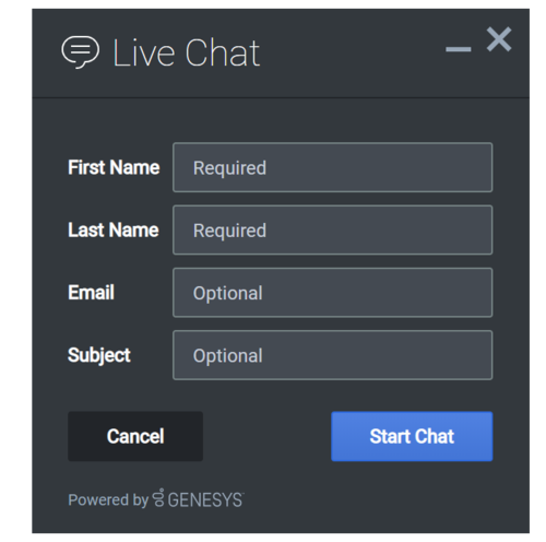
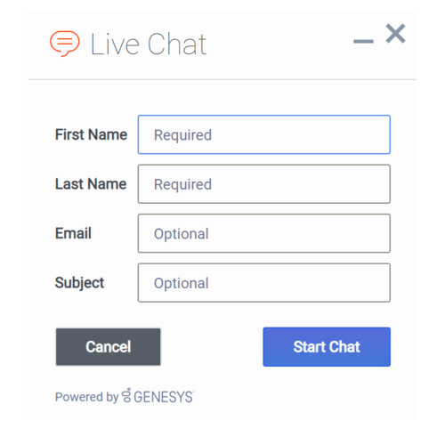
Genesys Widgets includes two built-in themes: dark and light. The dark theme is active by default.
Dark theme
Light theme
Set the active theme
There are two ways to set the active theme:
Configuration
window._genesys.widgets.main.theme = "light"; // or "dark"Widget bus command
window._genesys.widgets.bus.command("App.setTheme", {theme: "light"}); // or "dark"Create a custom theme
Theme templates
Genesys Widgets uses special LESS files called theme templates to define themes. Use a theme template to create a new color palette and add custom styles. Everything is laid out clearly in the template file.
LESS syntax defines local variables that allow you to create a clear color palette consisting of no less than 28 separate color variables, which are grouped by their usage:
- Background Colors
- Text Colors
- Icon Colors
- Border Colors
- Outline Colors
At a bare minimum, you can create a new style by simply changing the color values in the color palette. You can also add or remove colors from this palette as you see fit.
Color palette example
/* Color Palette */

@bg_color_1: 		#33383D; // Main Background Color
@bg_color_2: 		#444A52; // Form Inputs
@bg_color_3: 		#222529; // Button default
@bg_color_4:		#5081E1; // Button primary gradient 1
@bg_color_5:		#4375D6; // Button primary gradient 2
@bg_color_6:		#CCCCCC; // Button disabled / scrollbar color
@bg_color_7:		#212529; // Native scrollbar track color
@bg_color_8:		#A3A8AE; // Scrollbar color

@txt_color_1: 		#FDFDFD; // Main text color
@txt_color_2: 		#98A7B8; // footer text
@txt_color_3: 		#FDFDFD; // Button default & primary / autocomplete text hover color
@txt_color_4: 		#FDFDFD; // Hyperlink color
@txt_color_5:		#C5CCD6; // Placeholder color
@txt_color_6:		#F53131; // Alert/error color

@icon_color_1:		#FDFDFD; // Base icon color
@icon_color_2:		#8C8C8C; // Secondary icon color (multitone only)
@icon_color_3:		#000000; // Icon shadow color (multitone only)
@icon_color_4:		#000000; // Icon secondary shadow color (multitone only)
@icon_color_5:		#98A7B8; // Window control icon color
@icon_color_6:		#98A7B8; // Form input icon overlay color (e.g. "clear" icon)
@icon_color_7: 		#5081E1; // Interactive icon color 1 (attach files, delete file, etc)
@icon_color_8: 		#4AC764; // Positive Color (confirmation, availability, usually green)
@icon_color_9: 		#F53131; // Negative Color (error, exception, usually red)
@icon_color_10: 	#F8A740; // Warning Color (warning, pending, offline, usually yellow or orange)
@icon_color_11: 	#FDFDFD; // Icon color for primary buttons

@border_color_1: 	#222529; // Main border color
@border_color_2:	#2E69DB; // Button primary
@border_color_3:	transparent; // Button default
@border_color_4:	transparent; // Button disabled
@border_color_5:	#F53131; // Alert/error color
@border_color_6: 	#758384; // Form controls default state

@outline_color_1: 	#75A8FF; // Form input focus outline / autocomplete hover background color
@outline_color_2: 	#DAE6FC; // Outline color for primary buttons
Sample theme template files
Note: Click the following links to automatically download the sample template files to your computer.
theme-template-dark.less
theme-template-light.less
Theme templates are LESS files, which must be converted to CSS before being used on a website. Use a website or tool to convert them when you're ready to test and implement them on your site.
By default, theme templates override the styles of all of your Genesys Widgets—but you can also make changes that only affect a specific widget, as described below.
Name a theme
In the "dark" theme template file, the first class selector is defined as:
.cx-widget.cx-theme-dark
.cx-widget is the base class for the entire Genesys Widget UI. The outermost container of every widget or standalone UI element has this class and is used to identify UI elements that belong to Genesys Widgets.
.cx-theme-dark is the class name created for the "dark" theme. Themes are applied by searching for all elements with the .cx-widget class and appending the theme's classname to it. Thus, the combined class selector indicates styles that will be applied only when your custom theme is active in the configuration object.
You can name your theme classname anything you wish. There are no restrictions or limitations.
In a later step, you will register this theme classname in your configuration.
Customization guidelines
When you create your own themes, you can only use the following CSS properties:
- color
- background
- font-family
- font-style
- border-color
- border-style
- and other non-structural properties
Be careful not to modify the structure and functionality of the CSS when you make your changes. Otherwise, it won't work right.
Register a theme with Genesys Widgets
The following example shows how to register themes in the Genesys Widgets configuration.
window._genesys.widgets.main.themes = {
    "blue": "cx-theme-blue"
};
The name:value pair used here consists of a key ("blue") and the theme's CSS classname ("cx-theme-blue"). You can add as many themes to this list as you need.
Use a theme's key to make it the active theme:
window._genesys.widgets.main.theme = "blue";
// OR
window._genesys.widgets.bus.command("App.setTheme", {theme: "blue"});
Change the appearance of a specific widget
You can specify specific widgets—and even specific elements within a widget—by appending the widget's CSS classname to the theme classname.
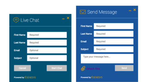
The following example shows how to extend the cx-theme-blue class with a widget-specific entry that makes the WebChat widget's background color a darker shade.
.cx-widget.cx-theme-blue, .cx-widget .cx-container{

    color: #FDFDFD;
    background: #1e5799;
}

.cx-widget.cx-theme-blue *{

    border-color: #7DB9E8;
}

.cx-widget.cx-theme-blue.cx-webchat, .cx-widget.cx-theme-blue .cx-webchat{

    background: #225897;
}
Widget-Specific and Element-Specific
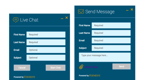
The next example shows how to extend the "cx-theme-blue" class with a widget- and element-specific entry that changes the background color of the input fields within the WebChat widget to a light shade of blue.
.cx-widget.cx-theme-blue, .cx-widget .cx-container{

    color: #FDFDFD;
    background: #1e5799;
}

.cx-widget.cx-theme-blue *{

    border-color: #7DB9E8;
}

.cx-widget.cx-theme-blue.cx-webchat, .cx-widget.cx-theme-blue .cx-webchat{

    background: #225897; // Darker Shade
}

.cx-widget.cx-theme-blue.cx-webchat .form input, .cx-widget.cx-theme-blue .cx-webchat .form input{

    background: #DCF5FF; // Lighter Shade
}
Change the layout and structure of a widget
You can only use themes to customize a limited set of styles for your version of Genesys Widgets. To create an alternate layout of your own design, disable the widget you want to customize and use the provided service plugins to build your own replacement.
Choosing Which Plugins to Load
Refer to the plugins configuration option here: app configuration
Service Plugins
Service plugins provide a high-level API for quickly integrating a UI with backend services. Each widget is matched with a corresponding service plugin. This separation allows for advanced integrations.
Change fonts
By default, Genesys Widgets downloads and uses Google's Roboto font hosted in Genesys Infrastructure. Please choose the nearest or appropriate region URL specified here or any other URL to download the roboto.css according to your preference and configure it through the googleFontUrl option.
window._genesys = {
 widgets: {
  main: {
    downloadGoogleFont: true,
    googleFontUrl: 'https://apps.mypurecloud.com/webfonts/roboto.css'
  }
 }
};Use the following CSS to specify a different font:
.cx-widget{ font-family: name-of-font-here; }The font you choose here will be applied to all of the Genesys Widgets.
Disable Roboto font download
To prevent Google's Roboto font file from being downloaded at startup from Genesys Infrastructure, set the main.downloadGoogleFont configuration option to false:
_genesys.widgets.main.downloadGoogleFont = false;If this option is set to true, Google's Roboto font will be downloaded from Genesys Infrastructure. The default value is true.
Change font size
By default, the font size in Genesys Widgets content is in em units. This is to support accessibility guidelines allowing font size to scale as needed when zoomed in or out based on the screen size. For normal text, the font size value is 0.75em and can vary for other text contents.Icons
Genesys Widgets are provided in SVG format, which means you can apply color fills and other SVG CSS properties when you use them. SVG also supports the highest possible rendering quality on all devices, regardless of the zoom level or resolution. You can scale the icons to fit any container; use them either inline or as blocks; and animate their orientation, colors, and other styling.
You can also use the Genesys icons in your own custom extensions, which allows them to match the look and feel of the default Genesys widgets. Here are some of the things you can do with them:
- Create a custom launcher button for chat, using the chat icon
- Create a custom widget with your choice of icon in the title bar
- Mix icons right in with your text, so you can refer to your widgets graphically
Genesys Widgets includes two sets of icons:
- The Multi-tone icon set uses several layers and colors per icon
- The Outline icon set takes a minimalist approach to both design and color
You can use these icons in any way that works for you, but please note that you can't customize or replace the icons.
How to use icons
Automatic HTML injection
Specify which icons you want and where you want them by applying the CSS cx-icon class and data-icon attribute to the appropriate elements:
<div id="your-element" data-origID="your-element"  data-origID="your-element"  data-origID="your-element"  data-origID="your-element"  data-origid="your-element" class="cx-icon" data-icon="chat">
 ...SVG icon will be inserted here
 </div>
When you pass the element into the CXCommon.populateAllPlaceholders( $("#your-element") ) function—as a jQuery-wrapped set or an HTML string—Genesys Widgets inserts the appropriate SVG icons and returns the HTML to you.
Fetching SVG icon markup
You can also fetch the markup for each SVG icon manually:
$("#your-element").append( CXCommon.Generate.Icon("chat") );


