Monitor workitems
Describes the six different workitem monitoring modes available from the iWD Manager Summary tab.
The Summary tab in iWD Manager gives you several options for displaying dashboards for monitoring the state of workitems controlled by iWD:
- All the displays reflect the currently selected time frame, the selected Category and Query.
- Where very large numbers of workitems are displayed, scientific notation is used on the axes of display graphs.
By backlog
Provides an intraday high-level summary of the backlog for the period chosen. This is the starting point for analysis, enabling you to quickly spot trends in KPI and potential bottlenecks in workitems. For example, it can enable you to quickly recognize that the backlog is growing or shrinking. It displays dynamically the overall backlog, the backlog by category, and arrival and completion volumes.
You can:
- Dynamically change the time interval and category for display.
- Dynamically select a saved search filter from the Filter & View tab for display.
- Hover over populated areas of the graph to display a detail panel for the date and time selected.
- Use your cursor to drag a box to select a range of columns and drill down to a lower level of detail.
Metric descriptions
- Overall backlog—The overall amount of workitems.
- Backlog by Category—The amount of wworkitems in distribution by category.
- Arrival and Completion Volumes—The amount of arrived and completed workitems in a time range.
By volume
Displays dynamic histogram and summary totals (total, average duration, average time in queue, average time in routing) for the selected time interval and category, and distributions by state (pie chart) and priority ranges (bar chart). You can:
- Dynamically change the time interval and category for display.
- Dynamically select a saved search filter from the Filter & View tab for display.
- Hover over points in any graph to display a detail panel for the selected data point.
- Use your cursor to drag a box to select a range of columns and drill down to a lower level of detail.
Metric descriptions
- Volume graph—The total number of new workitems that were submitted to iWD in a time range.
- Total—The total number of new workitems that were submitted to iWD during the reporting interval.
- Average duration—The average amount of time that elapsed before agents completed workitems. This metric includes the time that workitems were backlogged, as well as work time.
- Average Queued—The average number of workitems waiting to be queued.
- Average Routing—The average number of workitems waiting to be routed.
- Distribution by state—The distribution of workitems by their state, in percent and quantity.
- Distribution by priority ranges—The number of workitems that have different priorities.
By SLA
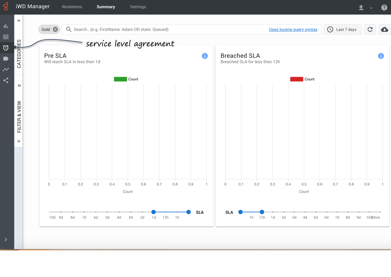
Displays dynamically workitem counts for selected pre-SLA intervals, and for workitems that have breached their SLA by selected intervals. You can:
- Dynamically change the time interval and category for display.
- Dynamically select a saved search filter from the Filter & View tab for display.
- Hover over populated areas of the graph to display a detail panel for the date and time selected.
- Use the sliders at the foot of the panels to change the time ranges.
Metric descriptions
- Pre SLA item counts—The amount of workitems that should be serviced in a selected time range.
- Breached SLA item—The amount of workitems that should have been serviced but were not, in a selected time range.
By categories
Displays dynamically the distribution of workitems across the available categories for the date and time selected. You can select current or historical time intervals for a rapid visual comparison.
You can also dynamically select a predefined query for display.
Hover over a Category chart to display information about that Category.
Metric description
- Distribution by categories—Distribution of workitems by categories.
By timing
Displays dynamically the volume of transactions, plus average duration times and average routing duration times. You can:
- Dynamically change the time interval and category for display.
- Dynamically select a saved search filter from the Filter & View tab for display.
- Hover over populated areas of the graph to display a detail panel for the date and time selected.
Metric description
- Volume—Total number of received workitems in a time frame.
- Average Duration—Average workitem lifetime and time before workitem becomes queued.
- Average Routing Duration—Average time that workitems spent in routing before being routed to the agent.


